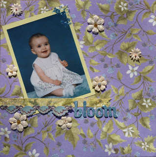
This is a photo of my niece when she was a baby. With 2 boys, I love the excuse to do a girl page once in a while- esp with girls I love as much as my 2 nieces :)
The paper is new K&Co (Thanks, J, for sharing a piece with me) and has beautiful foil accents on it. Mat is CS from archiver's; title is AC Thickers; flowers are prima with some stickles added; ribbon is May Arts.
I used to make LOs with tilted photos all the time and have not in quite a while so this fun sketch was a good catalyst to re-visit that technique :)Updated: Since taking the original pic, I added a small adhesive border at the bottom of the ribbon and a foil accent to the top right corner of the photo (both from matching K&Co embellie packs). I am an adder sometimes- esp after a shopping trip to Joann's *LOL* So, here is a new picture of the layout


this is cute. that paper is awesome!!!! LOVE IT!!!
ReplyDeleteLove how you've placed the flowers throughout the layout. Great take on the sketch.
ReplyDelete